What is a blog?
According to Andrew Sullivan (former editor to The New Republic, author, publisher and blogger) a blog is “the first journalistic model that actually harnesses rather than merely exploits the true democratic nature of the web. It’s a new medium finally finding a unique voice.”
Why blogging?
The answer lies in the fact that every human has a voice and wishes their voice to be heard.
I would say a blog is like a vehicle. All you need to do is to start it and you’ll have to figure out how to keep it running because, as far as I know if the engine stops, all the other vehicles will overtake you and you’ll find yourself as you were before “ no voice to be heard”.
We will focus on optimizing your “vehicle”. Keep it loud and running!
As a blogger in need for fast recognition you will need to find the best way to optimize your blog. I’m thinking here if you are more interested in having a better Search Engine Optimization, Conversion Rate Optimization or both of them.
Depending on your profile, you will probably choose one of them. My advice: go for both!
Table of Contents
- 1 Basic On-Page SEO Tips for Blogs
- 2 Conversion Rate Optimization for Blogs
- 2.1 1. Make sure that your CTA buttons look clickable
- 2.2 2. Define and know the points of interest of your page – Heatmap Usage
- 2.3 3. Have a compelling and short button copy
- 2.4 4. Use power words in your button copy
- 2.5 5. Create anticipation in your copy
- 2.6 6. Test and use the right font color
- 2.7 7. Use pop-up and slide-in forms the right way.
- 2.8 8. Use social media strategically for lead generation.
Basic On-Page SEO Tips for Blogs
SEO for blogs is defined by the content the audience wants and needs but also by what you need to tell your search engines, so they can share it to your target audience.
Some of the main keys we need to focus on are:
Keywords
- you need to find out what your audience is searching for on search engines
- for keyword research you can use tools like Ubersuggest or Soovle.
Title
- Title is very important as it leads your audience to your content and the search engines to your audience.
One thing is for sure, you need to think at the search engines as to your audience. Don’t make the difference as one of them might feel offended.
Rules for a properly optimized title:
- keep it under 60 characters
- use the focus keyword once
- don’t stuff it with keywords
- title has to be natural, relevant and clear for readers
URL
- The URL has to provide relevant information to your audience. You can use the title when possible.
Rules for a properly optimized URL:
- no date inside the url (just in case of duplicate URL’s)
- no underscores (use dashes if needed)
- no uppercase or proper case (use lowercase)
- avoid using dynamic parameters in the URL’s (?)
Meta Description
- Goes with the title and describes what the people will find on your website
Rules for a properly optimized Meta Description:
- keep it under 160 characters
- must include page’s main focus keywords but don’t abuse the keyword density
Headings
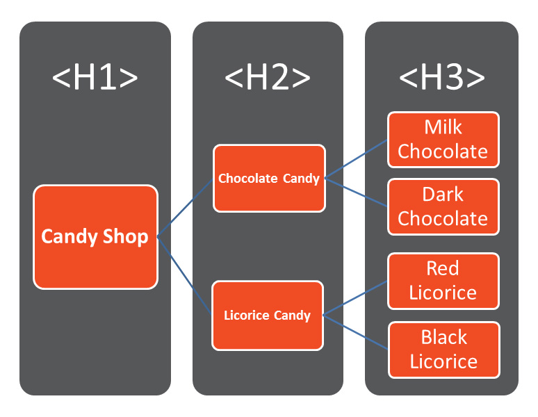
- Headings help both the audience and the search engines. The audience can read the content easier and it’s a signal for the search engines.
- Headings must be set accordingly to their importance from H1 to H6.
Internal linking
- keeps your audience on your blog
- increases traffic and time on site.
Content
How do you do keyword research?
Check for keyword density.
After we focused on SEO and we managed to acquire a decent percentage of Search Engine for our desired keywords, our main focus should move towards optimizing the page for a better conversion rate.
Optimizing a blog is more about retaining user attention and getting credit for spreading ideas than it is about optimizing content to match search relevancy algorithms.
Conversion Rate Optimization for Blogs
Conversion Pages Attributes:
The page may rank for keywords but is primarily concerned with direct conversions. Keyword targeting is secondary or may be unnecessary. We need to focus on one particular audience. To have a good start you should put your calls-to-action in people’s natural eye path.
- Clean and contrasting background to text color
- A distinct button text (e.g., “Get free access”)
- Have white space surrounding them
- Rectangular (sometimes rounded) shape
- Complementary border
The point of contact between your visitors and your offer is the call-to-action, whether buying, trying or sharing on social media.
2. Define and know the points of interest of your page – Heatmap Usage
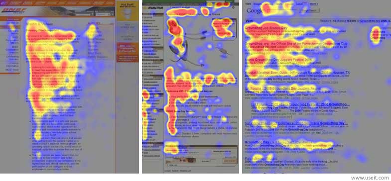
I would say, this is your map to success. As long as you will pay attention to this, the content and all the actions your audience will take will lead to conversion.
There is the “F” rule where all the attention of your audience will focus on this magical shape.
Of course, testing is the key but having this hint is easier to check your visitor behavior.
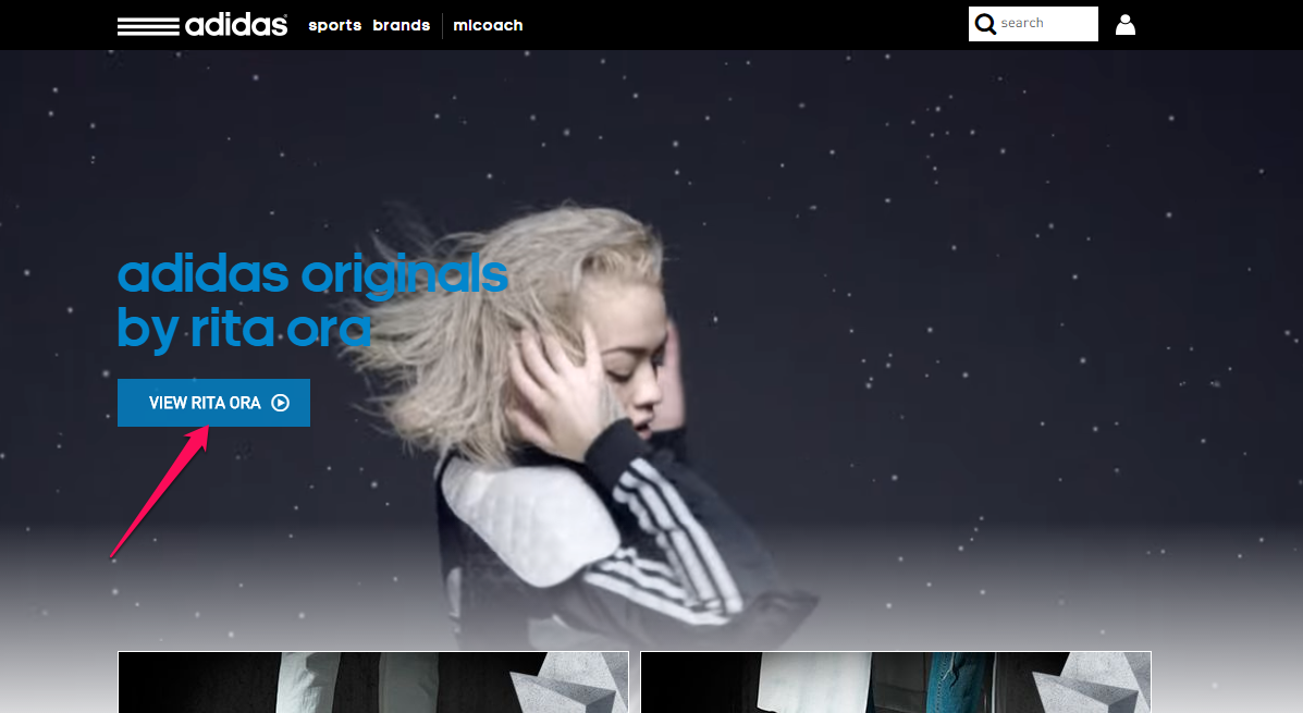
It’s time to click: “reading mood” to a “ready to act mood” has to be encouraged.
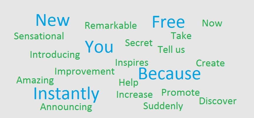
It’s proven that power words are the key. Why not to use them where you can confirm your audience impulse.
Here is an example of power words but may be different depending on your blog type.
5. Create anticipation in your copy
According to a research study reported in The Atlantic, 47% of the time, the human mind is wandering. Your mind wanders about a third of the time while you are reading or talking with other people.
It seems that the key to getting people to do what you want – e.g., click a button – is to promise a better experience.
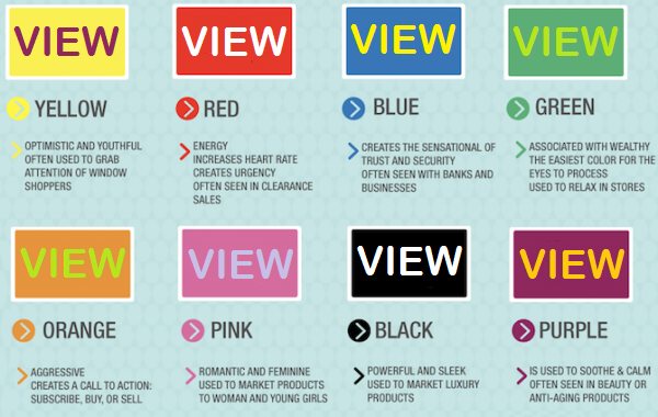
6. Test and use the right font color
- “If a good color sells, the right color sells better.”
Since less than 5% of the population suffers from color blindness, color theory should be explored.
There’s no perfect color for any specific emotional state. You can’t accurately say “red is the best color for CTAs,” or that “green symbolizes wealth and productivity, which means that you should always use it in those niches.” There is no one color rule – you just have to test out options for yourself.
7. Use pop-up and slide-in forms the right way.
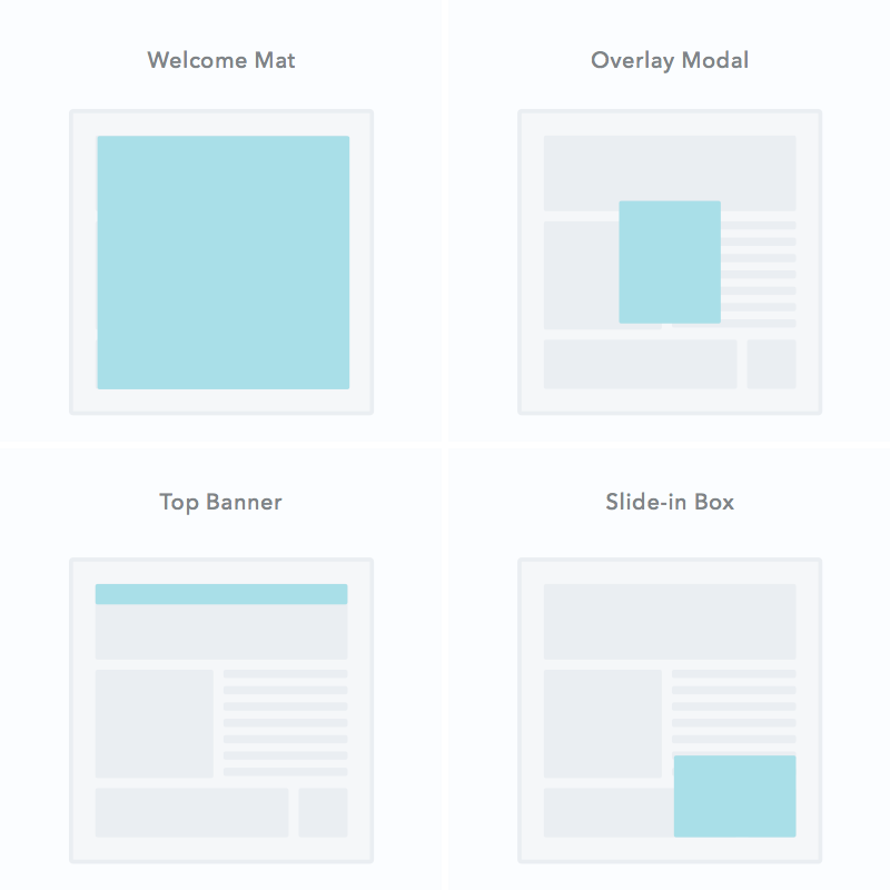
There are four types of pop-ups. Depending on the information you are about to show, a pop-up may be pleasant or annoying. You have to make sure you will provide the best user experience in order for you to reach your goal.
- Welcome mats: Full screen pop-ups that slide above page content
- Overlay modals: Center screen pop-ups that appear on top of page content
- Top banners: Small banners at the very top of the page
- Slide-in boxes: Small boxes that slide in from the side/bottom of the page
Action:
- Page entrance:Pop-up appears when the visitor first gets to the page
- Page scroll:Pop-up appears when the visitor scrolls to a certain point on the page
- Element interaction:Pop-up appears when the visitor clicks on or hovers over a specific element
- Time on page:Pop-up appears when the visitor has been on the page for a specific amount of time
- Exit intent:Pop-up appears when the visitor scrolls towards the top of the page to leave
Timing:
Wait X seconds before showing the popup
Show when user scrolls to X% of your website
Show when user attempts to leave your page (exit intent)
TIPS:
- Give them a tease. If a visitor closes the form, they can be shown a teaser in the bottom of the site which can be opened at any time. You can see how many visitors sign up after having closed the form.
- Keep it closed. If the form is closed, it will not reopen during the same visit/session.
- Give it a limit. It’s essential to set a limit for your form. All Sleeknote pop-ups are created with a default limit on four exits from a single person. After this, the visitor will never see it again. You can also modify this to your needs.
- Don’t show it again. Finally, if a visitor signs up, they are counted as converted and will not see the form again.
Some additional tips include:
- If you’re using a timer, set it to at least five seconds.
- Make sure your form is not shown during checkout, receipt pages or other conversion points. After all, you don’t want to interrupt potential customers during the process of buying.
- Avoid more than one pop-up on the site at one time. You can easily have a slide-in and pop-up on the same site, but never two different pop-ups.
- Think about the copy on your call to action button. For call to action tips, check out our how to create the perfect call to action post.
The goal of a brand social media page is to get a follower over the blog, not the other way around.
If they click over to your social page, they may not return and may not convert.
INCLUDE IT ON THE BUSINESS WEBSITE
Have you provided people with a way to easily access the blog from the company website? Even if you have opted to host your blog on a separate domain from the business website, you still need to make sure that they are both accessible to one another. One of the biggest reasons for this is that the company website gives the blog a level of credibility that may not exist if they don’t realize that the blog is part of the overall web presence of your company.
When the website and blog aren’t able to be navigated from one to the other, vital information that conveys trust to the visitor is missing. If the blog is part of the business website the visitor automatically knows who the author is, what the industry is, who they can contact, etc. The website navigation is right there for them to see. As a result, this establishes a sense of credibility and trust, which could then encourage the website visitor to take the desired action.


![Getting Started with Landing Pages [and Conversion Funnels]](http://www.seonick.net/wp-content/uploads/2015/05/banner_blog_landingpages-110x80.jpg)

